


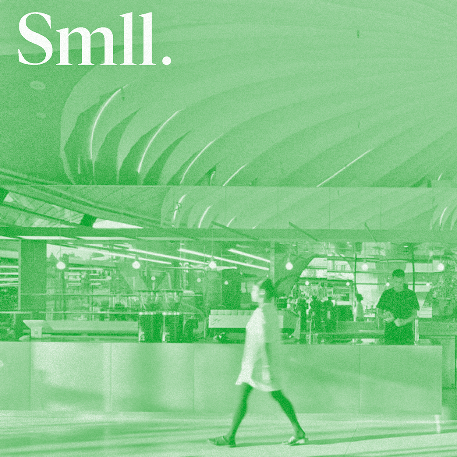


Sungiven Foods


Description
Sungiven is known for its premium Asian produce in over 100 stores across Asia. They opened their first supermarkets in Vancouver, and with plans to expand further throughout North America, they desired a refreshed, modern and friendly image to attract new foodies.
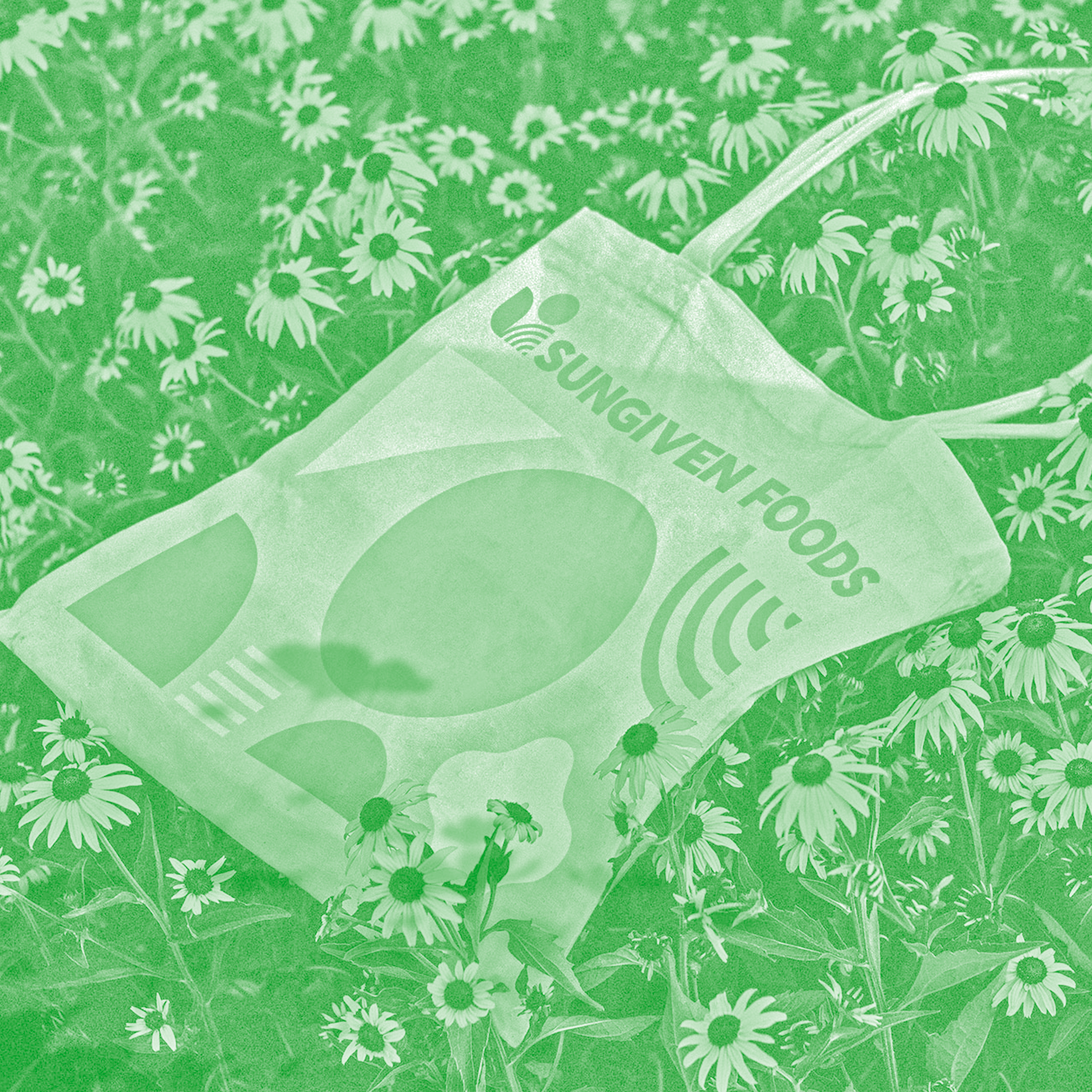
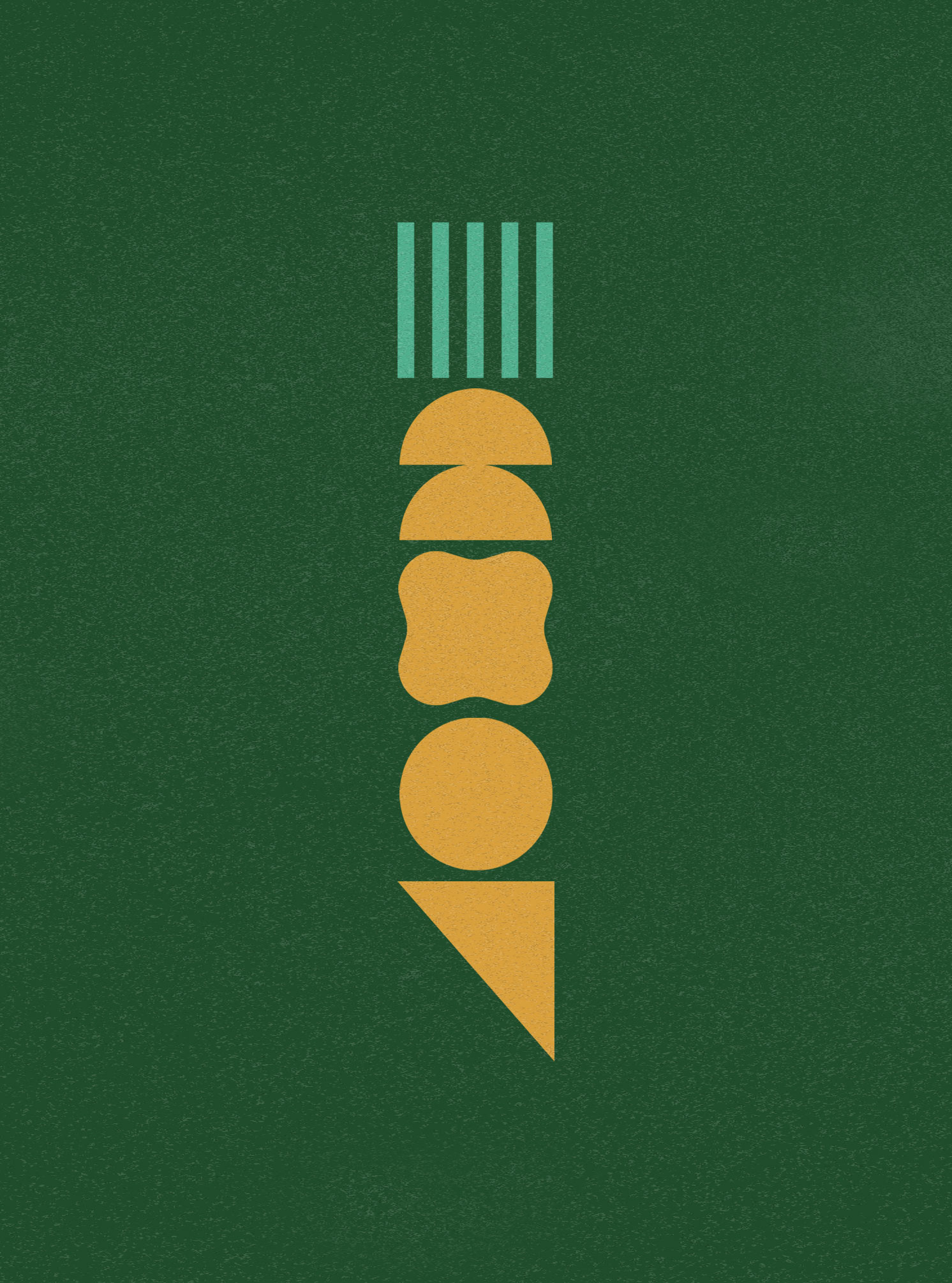
Inspired entirely by the sun, Sungiven's visual identity features a graphic language of geometric shapes. Each block represents a unique expression of the sun (ex. sunbeams, sunrises and sunrays). These modular design blocks can be interchanged, creating a flexible design system that can form icons, illustrations, and graphic compositions.
Beyond the logo, a detailed brand style guide was designed to articulate the design values and aesthetic principles of Sungiven—both to empower their team and partner agencies to expand the visual language across diverse applications.
Info
Client
Sungiven Foods
Sungiven Foods
Role
Creative Director, Brand Designer
Creative Director, Brand Designer
Credits
Luis Kuo
Project Manager
Gary Lee
Interior Designer
Project Manager
Gary Lee
Interior Designer
Flowmarq
Brand Production
The Designers Foundry
Type Foundry
Brand Production
The Designers Foundry
Type Foundry